
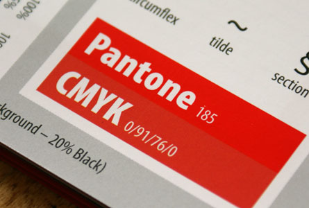
 Spot Colors
Colors created without screens or dots, such as those found in the PANTONE MATCHING SYSTEM®, are referred to in the industry as spot or solid colors. From a palette of 14 basic colors, each of the spot colors in the PANTONE MATCHING System is mixed according to its own unique ink mixing formula developed by Pantone. You probably mixed yellow and blue paint to get green in your youth. Creating a PANTONE Spot color is similar in concept, but with the added need for precision.
The precision begins with the printing ink manufacturers who are licensed by Pantone to manufacture inks for mixing PANTONE MATCHING SYSTEM Colors. To retain their license, they must annually submit samples of the 14 basic colors for approval by Pantone. Printers can then order the colors by number or mix it themselves according to the ink mixing formula in a PANTONE® FORMULA GUIDE. A PANTONE Chip supplied with the ink and/or job ensures that the printer achieves the color desired by the customer.
Each color in the System has a unique name or number followed by either a C, U or M. The letter suffix refers to the paper stock on which it is printed: C for Coated paper, U for Uncoated paper and M for Matte paper. Also created without screens, PANTONE metallic and pastel colors are considered part of the PANTONE MATCHING SYSTEM.
Due to the gamut of the 14 basic colors, some spot colors will be cleaner and brighter than if they were created in the four-color process described below. Spot colors are commonly used in corporate logos and identity programs, and in one, two or three-color jobs.
Process Colors
This method of achieving color in printing is referred to as CMYK, four–color process, 4/c process or even just process. To reproduce a color image, a file is separated into four different colors: Cyan (C), Magenta (M), Yellow (Y) and Black (K).
A color image is separated into CMYK. When printed on paper, the original image is recreated.
During separation, screen tints comprised of small dots are applied at different angles to each of the four colors. The screened separations are then transferred to four different printing plates, one for each color, and run on a printing press with one color overprinting the next. The composite image fools the naked eye with the illusion of continuous tone.
Process colors are represented as percentages of cyan, magenta, yellow and black. Varying the percentages offers thousands of color possibilities. When four-color process printing is used to reproduce photographs, decorative elements such as borders and graphics can be created out of process colors. This helps to avoid the added expense of an extra plate needed to print each spot color.
PANTONE 4–COLOR PROCESS guide set. Displays 3,010 CMYK combinations with screen tint percentages. A guide on uncoated paper is included in the set.
Converting spot colors to process colors.
Often times, a spot PANTONE MATCHING SYSTEM Color is requested when creating a four–color process piece. To save money, the spot color should be evaluated to see how it will look if printed in CMYK. While some colors can be simulated well, there are many that look quite different. As the quality of the resulting color conversion is very subjective, the designer can make decisions using the PANTONE® COLOR BRIDGE™ guide.
The PANTONE® COLOR BRIDGE™ guide displays each PANTONE MATCHING SYSTEMColor and its corresponding simulation in CMYK.